Using Generative AI to Evaluate Image Alt Text (Generative AI Experiments)
Created //
TL;DR // I used generative AI to generate images using the alt text from my photographs as the AI image prompt. Jump directly to the results here.
I stumbled upon a different way to evaluate whether the alt text I was writing was effective.
It might seem a little weird.
I've been writing a lot of text prompts to generate images with Stable Diffusion recently (specifically SDXL 1.0 via Noiselith). I realized what I'm doing is trying to more accurately describe the content I want to see. This is the entire intent of accessibility alt text for images in digital media.
Sometimes my prompt is ok, and sometimes it's clear I'm missing something. It's a good reminder that your own interpretation of a description can be entirely different than someone else. (Especially when that 'someone else' is a generative AI tool.)
So... I decided to try a little experiment.
The experiment
Here's what we're going to do:
- Take alt text I've written for my own photos
- Use the alt text to generate new images with Stable Diffusion
- Compare the resulting images vs the original photos
Will the images contain the key elements as the original photos? Are there any common patterns that get missed? Is our alt text effective as an image generation prompt?
In the process, let's learn what kind of details are important and what I've been missing.
What is "alt text"?
For people with visual impairments. we need to provide a text alternative for visual media. A transcript for a video would be one example. For images, this text alternative is typically referred to as "alt text" (because it is implemented in HTML with the alt attribute).
Remember, in this example you'd only be hearing the description of the image. You might not be able to see it. So the alt text needs to be descriptive enough to convey the same meaning of the image that someone would get if they could see it.
We're not going to get into the nuances of alt text, how context matters, the difference between 'good' and 'bad' alt text, etc. But if you're interested, you can follow these links:
Caveats
We're using image generation tools as a proxy for another person. It helps us see the a different interpretation of the alt text, and gives us something to compare against.
If the generated images are good -- or bad -- it doesn't necessarily correlate to the quality of the alt text. We assume that the Gen AI tool is interpreting the text similar to how we do. There's no guarantee about that! But hey, it's an interesting exercise and I'm curious so let's just go with it.
Results
Photo 1 // Worker's locker room
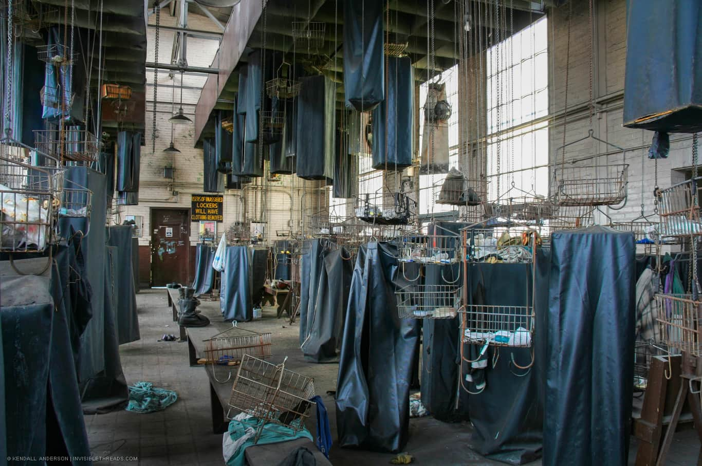
Original alt text Rows of bags and baskets hang on chains from the ceiling. Some are hoisted to the ceiling, and others are at ground level. Many baskets are empty while some still contain personal items from former workers. (View original image)
Generated image 1

Generated image 2

Analysis
I interpret the original image as a locker room and the generated images as inside a warehouse.
Both images have rows of baskets. The second image looks like it's attempting to address the text "hang on chains from the ceiling" but it's not very good. It's interesting that both images interpreted "baskets" in a similar way, and it points out where our prompt was lacking.
The generated images also seem to have more of a warehouse feel rather than a locker room.
How could the alt text be improved?
- Describe the materiality of the baskets: wire metal open baskets
- Describe the fabric covering around the baskets that is a key visual feature
- Reinforce the idea of many chains hanging from the ceiling
Photo 2 // Interior corner with peeling paint
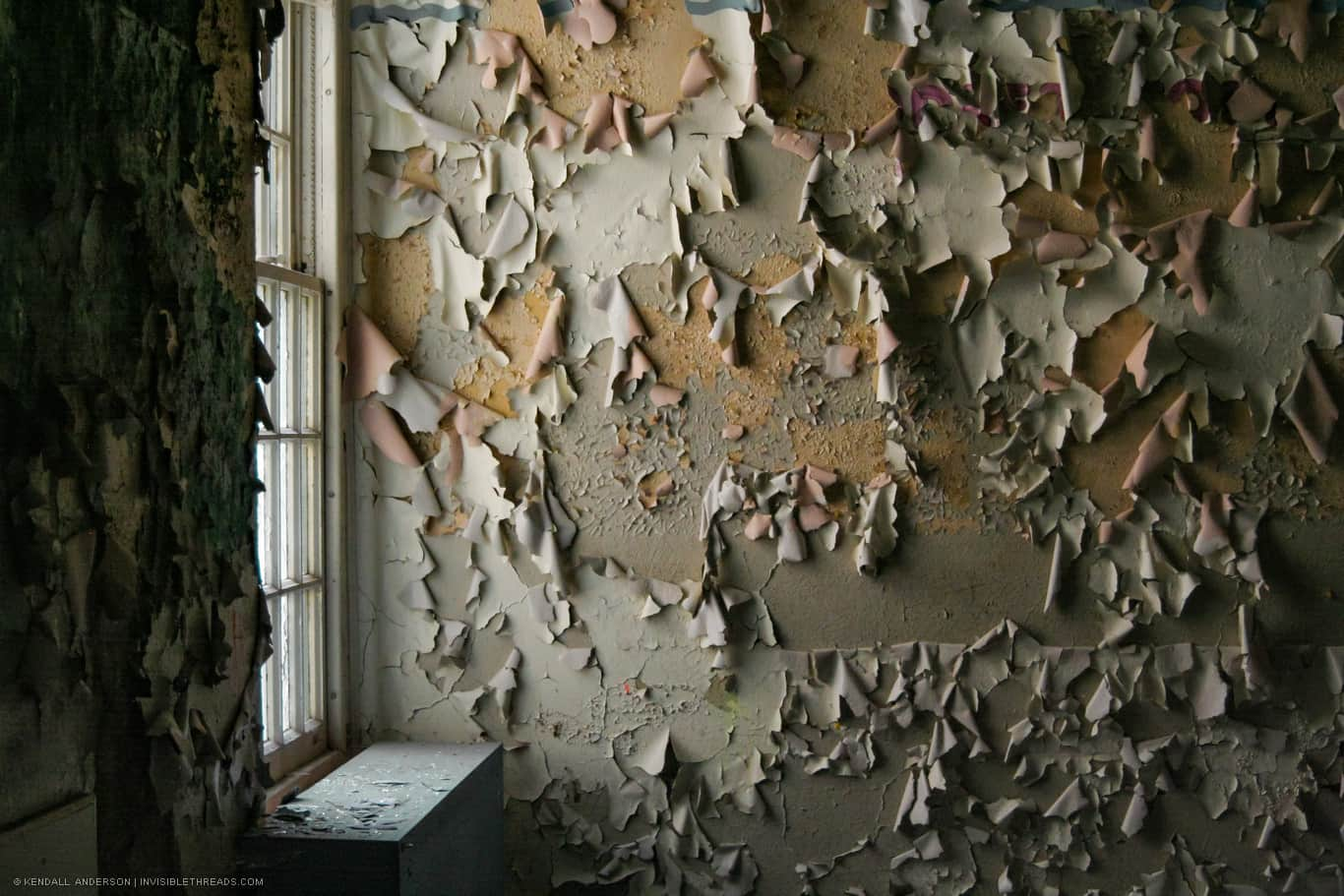
Original alt text A window allows sunlight into the corner of a room. Layers of paint on the walls are peeling off in large pieces. The entire wall is peeling paint. (View original image)
Generated image 1

Generated image 2

Analysis
Not bad actually! Granted, the subject matter is very simple, but I think the generated images are functionally very similar to the original.
How could the alt text be improved?
- Reference the quantity and size of the flaking paint on the wall
- Describe how the frequency of flaking paint is similar to a texture
- Indicate the extreme nature of the decay (i.e., it's not just some peeling paint, but an entire wall surface that is peeling)
- Provide direction about the camera angle, so we're looking more at a single wall
Photo 3 // Abandoned school hallway
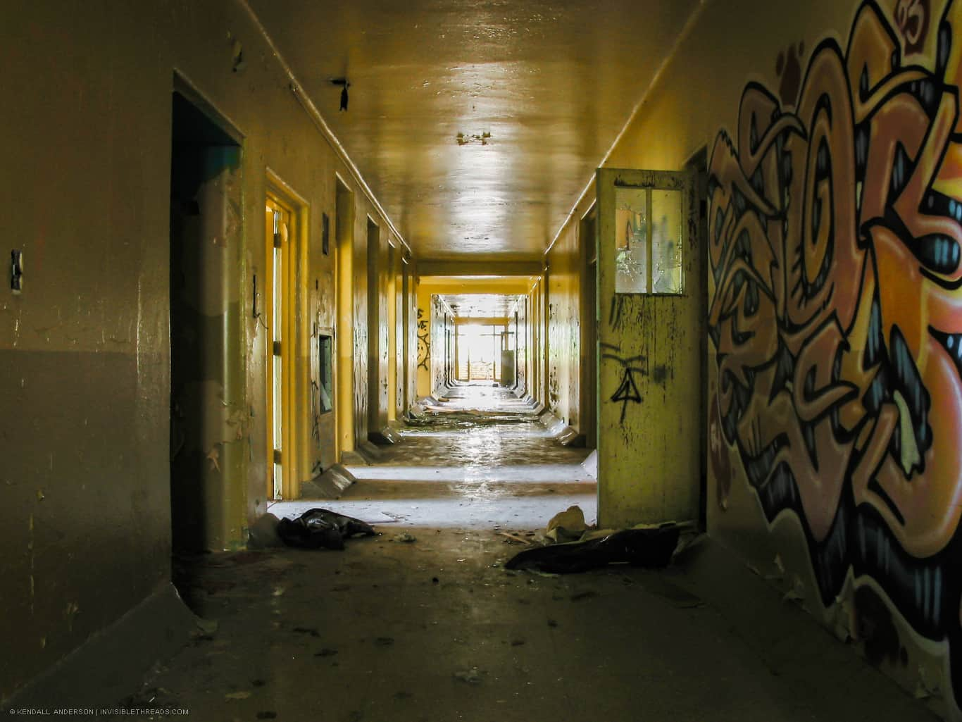
Original alt text A dark yellow corridor has a large piece of graffiti on the wall. Patterns of light and dark illuminate the hallway from the rooms to each side. Debris is strewn about the corridor. (View original image)
Generated image 1

Generated image 2

Analysis
This is another case where the generated images are effectively the same as the original photo (in terms of content). Why? Probably because the original image (and its alt text description) is very, very simple.
How could the alt text be improved?
- Emphasize the association of the light and dark patterns with the door openings to rooms
- Indicate that the end of the hallway is a window, and the light is coming from there
Photo 4 // Decaying stairwell
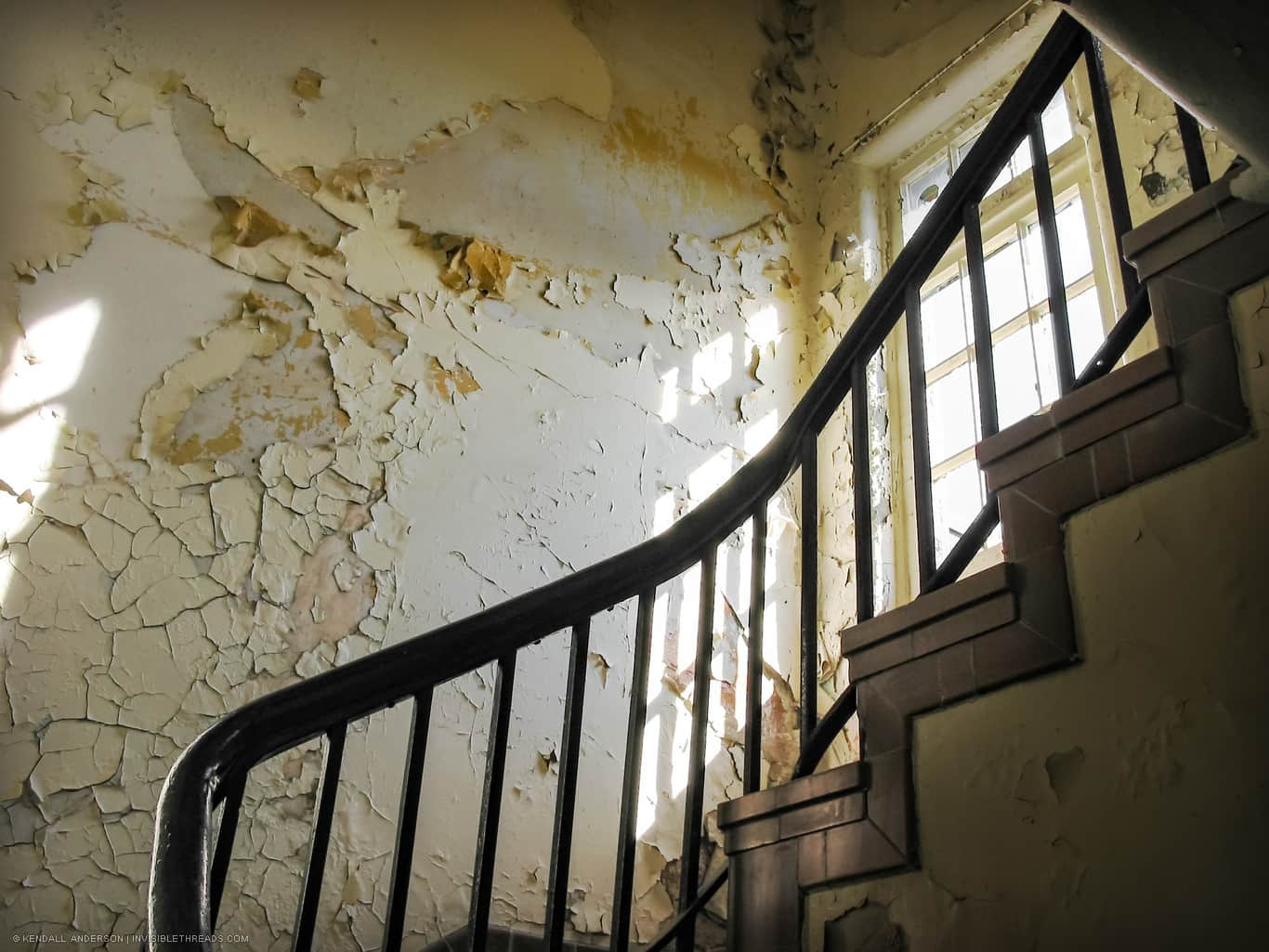
Original alt text A railing leads up a spiral staircase. A window lets in light, highlighting the cracking and peeling paint on the walls. (View original image)
Generated image 1

Generated image 2

Analysis
The style, character and tone of the two generated images matches the original photo very well. Interestingly, none of that is part of the alt text description. I'm guessing this was a lucky coincidence.
The biggest difference between the photo and the generated images is the framing of the shot. It's debatable whether the framing should be described differently in the alt text in terms of how it would change the perception of the image.
How could the alt text be improved?
- Provide direction to frame the image closer to the railing, to indicate we aren't aware of the full size of the stair
Photo 5 // Industrial control room
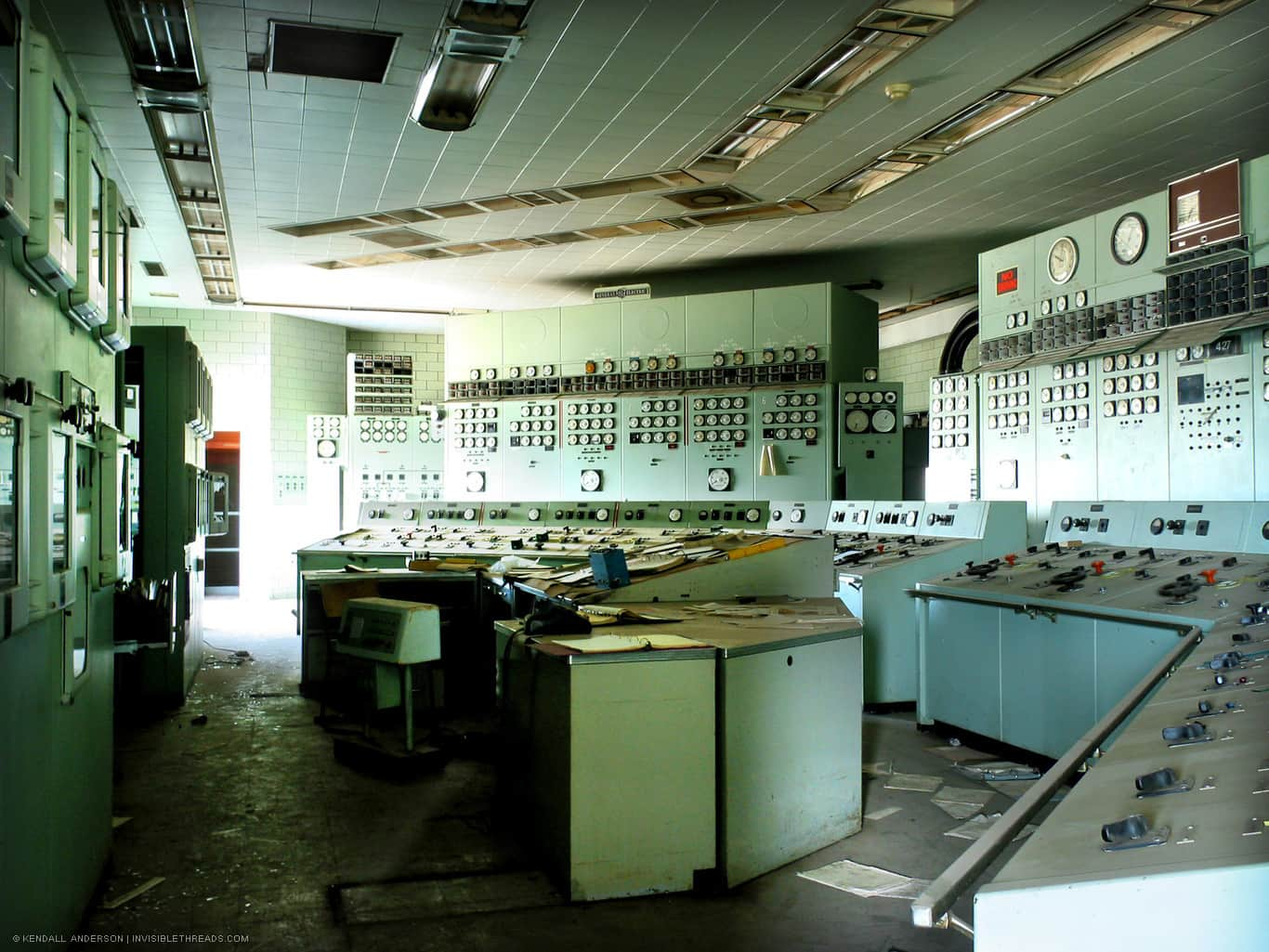
Original alt text Multiple banks of instrument panels with gauges, switches, levers, dials and knobs are in a small room. The room is lit from the left with bright sunlight from a window. The control room is abandoned, and debris and papers are strewn about the desks and floor. (View original image)
Generated image 1

Generated image 2

Analysis
The alt text for the source photograph is very specific and detailed. This probably helps explain why the generated images contain a similar level of detail. The light quality has a bit to be desired. While it's mentioned in the prompt, it maybe could be emphasized more.
The abandoned nature of the room and presence of debris and decay is uncannily similar.
How could the alt text be improved?
- Describe the light quality more, and emphasize the single window source
- Reinforce the idea of the abandoned nature of the room, and the debris on the floor
Photo 6 // Abstract collection of red pipes
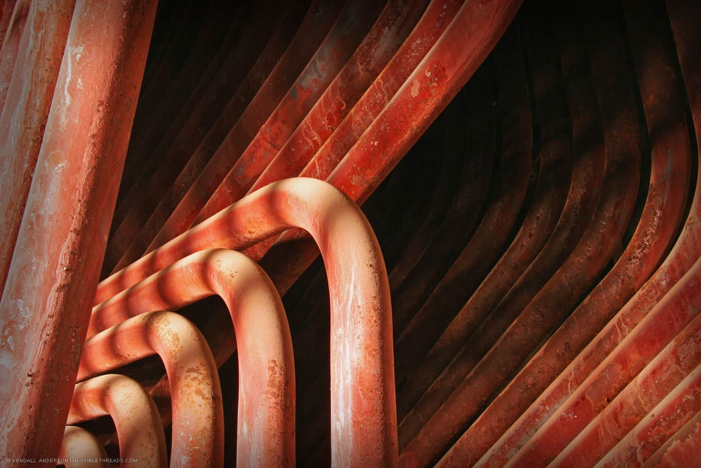
Original alt text Multiple red pipes are grouped together, into 4 distinct groups. The pipes curve and bend together, forming an abstract pattern and texture. (View original image)
Generated image 1

Generated image 2

Analysis
Well, not quite. Maybe it's an unfair comparison, given that the source photograph is effectively an abstract composition. But the given alt text doesn't really do a good job of describing the different shapes, patterns, textures and shadows found.
Both of the generated images are missing the structure of the original photo. The second image is effectively spaghetti.
How could the alt text be improved?
- Describe the different shapes, patterns, textures and shadows found
- Reference the texture of the pipes
- Reference the different repetitive lines
In summary
Colour doesn't indicate content, but it's important for image generation
Colour is something that I hadn't realized I don't consistently describe in alt text. That seems to make sense to me if I'm assuming the audience is someone who can't see the image (and presumably -- a big presumption -- they can't see colour).
One of the key accessibility rules is to not depend on colour to differentiate between elements. That's why we tend to not describe things on the basis of their colour when it comes to accessibility.
But for creating an image via generative AI tools, we need to specify colour (if we care about it).
Style affects mood and character
Some of the alt text examples did express some hints about style: decay, abandoned. But given that most of these photos don't really have a style (other than "photograph"), it's not something I've been consistently describing. It also makes me question whether that's necessary for alternative text. But like colour, it's helpful for an image prompt.
Describing an abstraction is hard
I only had one example of an abstract image, and it was a failure for the generative AI tool. But that's mostly because my alt text didn't provide enough direction.
Closing
Looking at it now, the source photographs we chose were fairly simple. They didn't have great complexity or detail in terms of their subject matter. That's probably why the generated images were fairly close when using the alt text.
If nothing else, this helps me realize that description is critical to alt text, including style, colour, mood and tone. The next time we try this experiment, it'll also help me be more selective about the source images to try it with.
![]() // ka
// ka